
Easter's soft power: comfort, colour, and design in bloom

Everywhere you look right now, things are getting softer. Furniture is curvier. Packaging feels more tactile. Even recipes on TikTok come with a side of pastel or jelly-like wobble. It’s a shift that goes beyond aesthetics — it’s emotional. After years of screen-heavy living and sharp, functional design, we’re craving comfort, play, and things that feel good to hold.
That softness is showing up across disciplines— in homeware, fashion, food — and maybe that’s why Easter, with all its pastel tones and foil-wrapped charm, feels so in sync with the moment. It’s already full of small rituals that are tactile, joyful and nostalgic by design.
Easter becomes more than just a holiday, it’s a design moodboard. A moment built around colour, texture and slowing down. A reminder that softness, even when seasonal, can still shape how we see and feel the world around us.
Between minimal and maximal
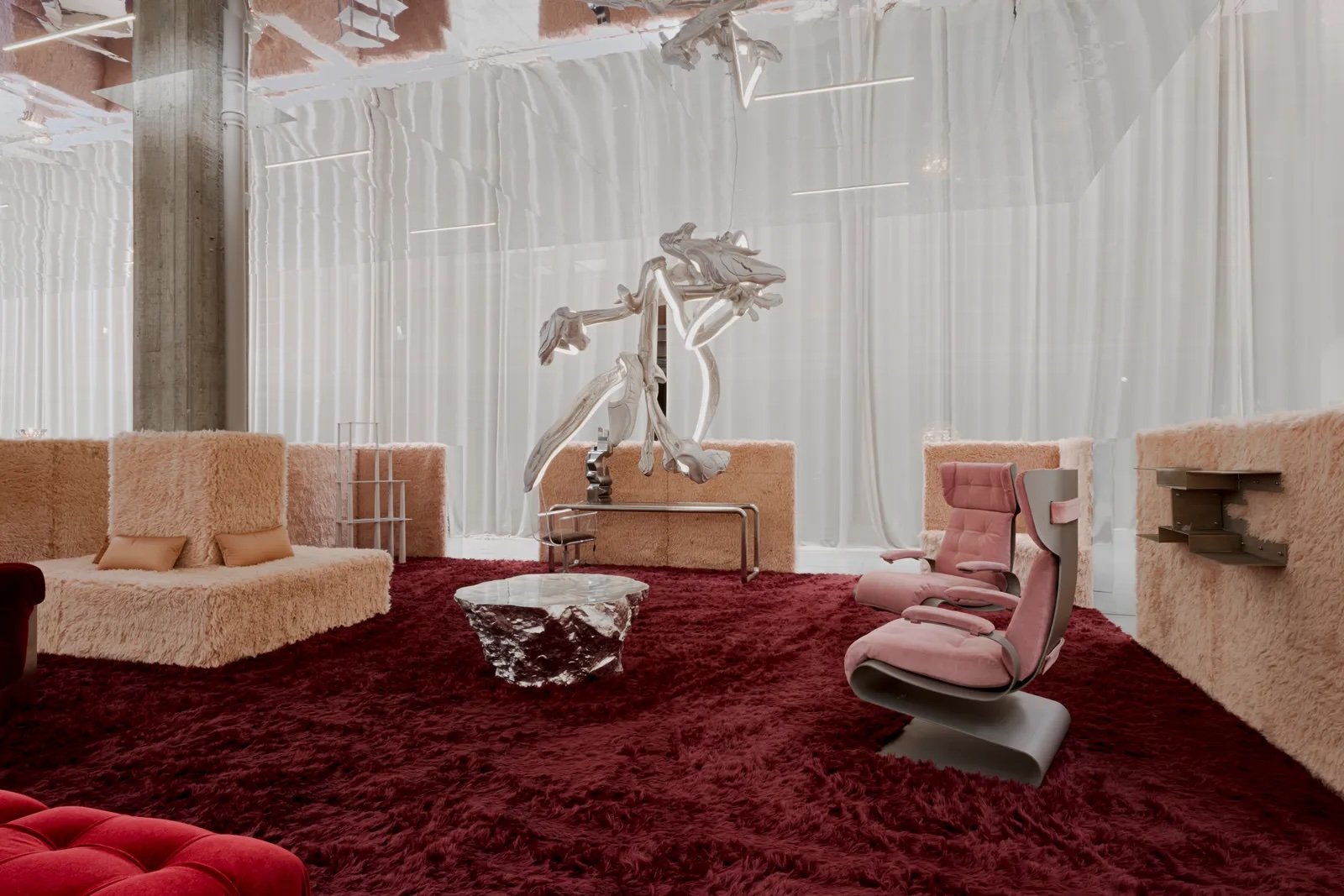
‘Silver Lining’ by Nilufar, Milan Design Week 2025
For years, the conversation in design has often swung between two poles: minimalism and maximalism. One, a promise of peace through clarity; the other, a celebration of excess and personality. But somewhere in between, a new language is forming: one built on comfort, nostalgia and sensory pleasure.
Designers are responding with a visual and material softness — rounded corners, pastel gradients and fluffy textiles. These elements, once dismissed as childish or kitsch, are now taking centre stage at Milan Design Week, where Architectural Digest recently noted a resurgence of "whimsy and playfulness" in furniture and interiors.
This shift isn’t just about form. It’s about how things make us feel. Soft design is a counter-response to the coldness of hyper-functionality and the fatigue of digital overload. It invites slowness, sensuality and sometimes even silliness. It reawakens our sense of physical connection in a world increasingly lived through screens.
Curves and colour
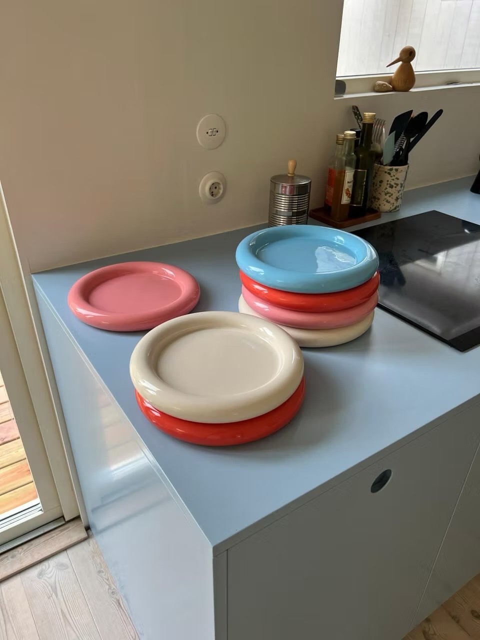

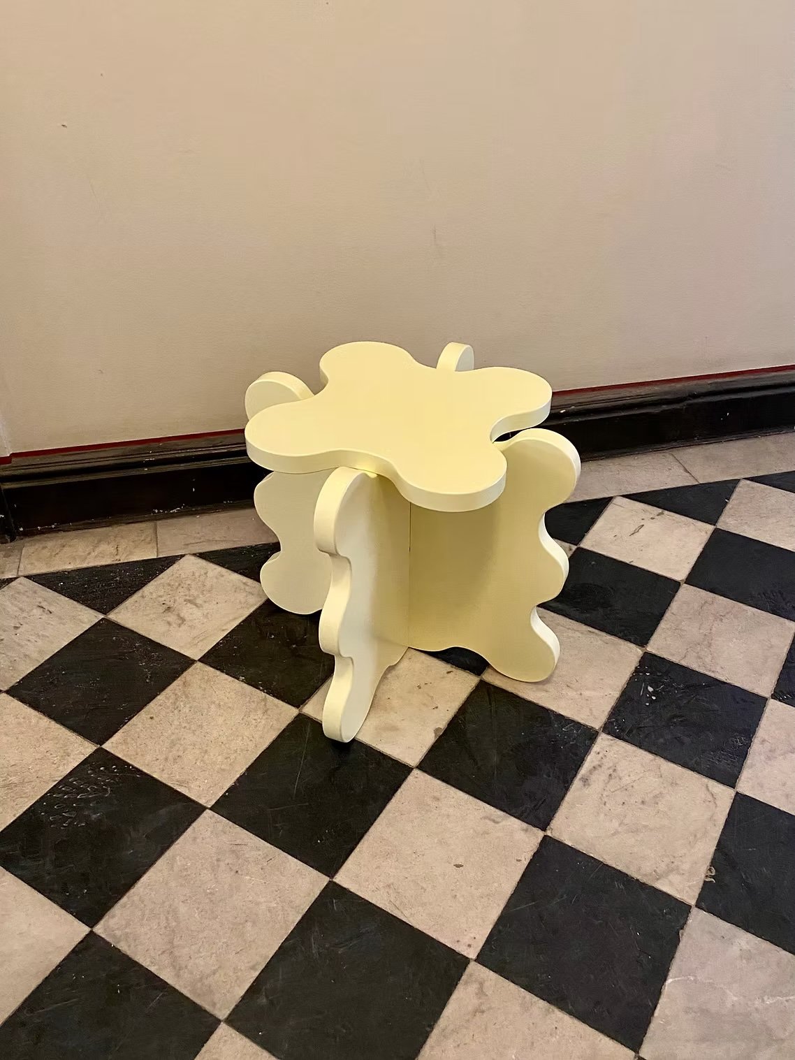

Take Swedish designer Gustaf Westman, whose blob-shaped mirrors and pastel-hued furniture have become icons of the soft design movement. His pieces don’t just furnish a room — they invite interaction, joy and a little bit of play. "I usually describe my design as very easy to understand; it's very few elements that create the object, and it's always built upon an idea," he told designboom.
His work has gained particular visibility thanks to social media, notably through Nara Smith, whose pastel-toned TikToks feature Westman’s now-iconic bubble plates. She’s known for plating her elaborate "from scratch" meals on his beautifully sculptural dishware — proof that even homemade bubblegum or a lineup of DIY condiments can feel elevated when served on a pastel pedestal. The pairing of her dreamy domestic aesthetic with his playful, bubbly forms helped drive a wave of interest in this genre of design, where form, colour and feeling intersect.
And this kind of soft object design is everywhere now: from wavy lacquer side tables to mushroom-inspired lamps to the viral resurgence of modular, squishy sofas. It shows up in everyday design moments too, like the curve of a lipstick tube or the rounded edges of a phone app. We are softening the edges of our world. And softness isn’t just showing up in our spaces — it’s transforming how we package, wear, and even eat.
Softness you can hold and see


Easter packaging is a masterclass in sensory storytelling. Take the Lindt Gold Bunny: more than just a piece of chocolate, it’s a tactile ritual — from the crinkle of the foil to the delicate red ribbon. It taps into something deeper than nostalgia. It’s about intimacy, detail and the idea that small, seasonal pleasures deserve to be beautifully made.
Luxury chocolatiers and department stores have followed suit. Today’s Easter eggs are often housed in hand-painted ceramics or sculptural boxes that feel more like objets d’art than packaging. In this world, the container is part of the experience — designed not only to be opened, but also admired, gifted or saved.
This soft, sensory-first approach doesn’t stop at packaging. It carries through other creative disciplines as well. In fashion, it’s in the textures and tones — like Sandy Liang’s fuzzy accessories or STAUD’s puffy moon bags. In food, it shows up in the jiggly texture of Nara Smith’s from-scratch jelly candies, the viral butter candle trend that turned soft fat into a centrepiece, or the warmth of Japanese milk bread, sliced thick and served soft.
Across all of these spaces, design is dialling down the hardness and turning up the tactility. It’s softness you can hold, and softness that holds you back. And as we head into the season of foil-wrapped bunnies and jelly-filled moulds, it’s no surprise that Easter captures this energy perfectly.
Why now, why Easter?
Easter lands just as the world starts to feel lighter, when colour creeps back into our days, the light hangs around a bit longer and everything feels a little bit softer. Whether it’s a foil-wrapped bunny or a hand-dyed egg, the holiday is full of small rituals that are playful and joyfully familiar.
Its visual language — all pastels, soft curves, and glossy finishes — syncs perfectly with where design is going right now. There’s a collective pull toward comfort and care.
So maybe Easter isn’t just cute. Maybe it’s the design brief we didn’t know we needed. In the end, Easter might just be the moodboard of the moment.